- Home
- All Products
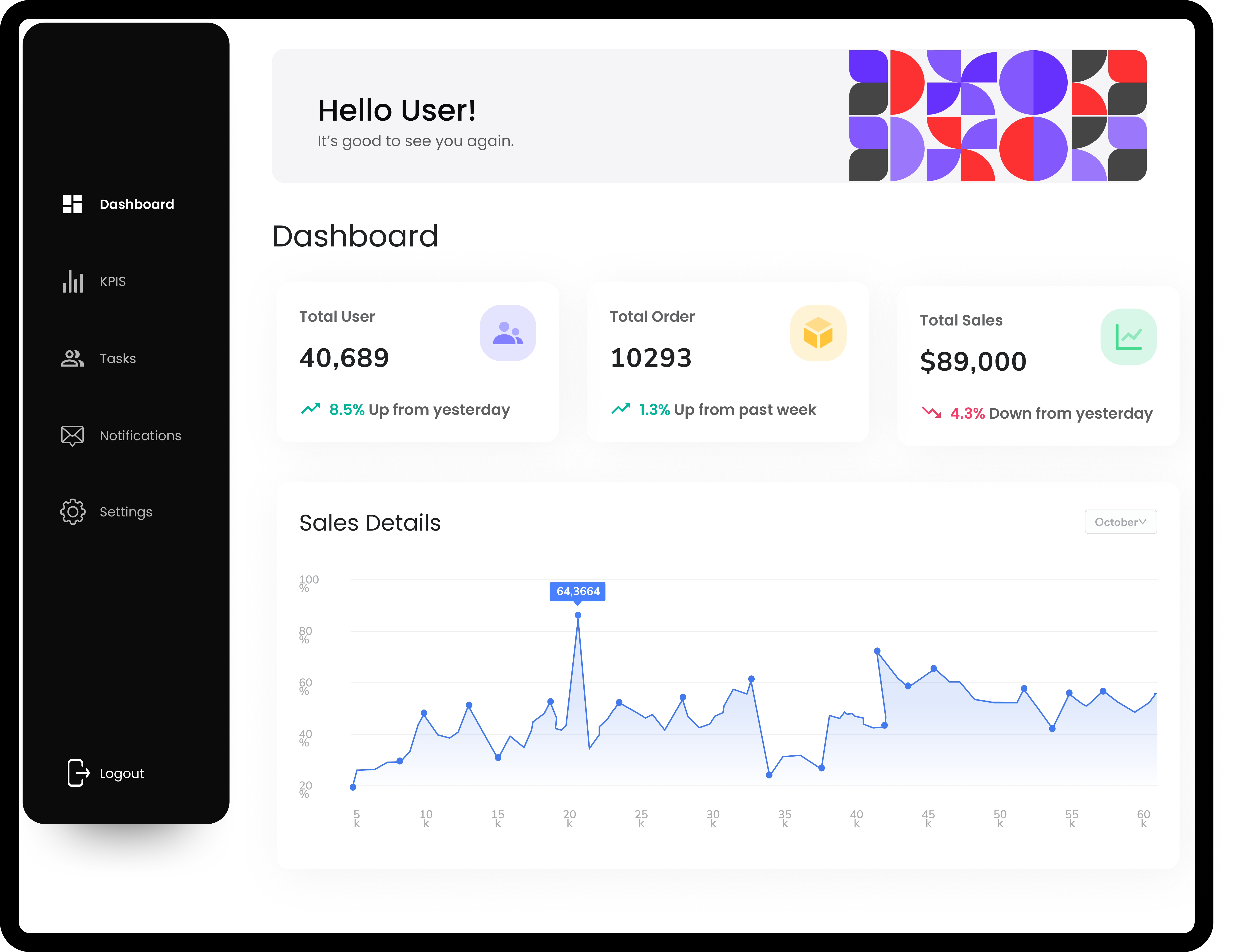
- Dashboard Management System
Your complete all-in-one integrated
Dashboard System
built for success
Dashboard Management System allows aggregation, measurement, and display of KPI’s, which enables organizations to measure performance, detect patterns, and make data-driven decisions.
-
No credit card required
-
Cancel Anytime
All In One Dashboard Solution
The Dashboard Management System by Inlogic IT Solutions is an all-encompassing platform tailored to administer every dashboard type to track KPI's maximizing efficiency and stakeholder satisfaction.

Login Workflow
Dashboard Admin Flow


How Dashboard System Work
Why Choose
Inlogic's Dashboard Management?
Inlogic’s Custom Dashboard Management System has the most important functionality to assist companies with data analysis and administration. Consolidating data, monitoring it in real time, building customized dashboards and assigning user roles — the platform provides a single destination for decision-making and performance optimization.
Operational Efficiency
Custom Dashboard Management System can help optimize operations by monitoring KPI’s and metrics. By discovering bottlenecks and tracking performance in real-time, businesses can streamline workflows and be more productive. Such an operational agility keeps companies flexible and up to date.

Integrations with 3rd party plugins
Integrate effortlessly with your favorite apps. Enhance functionality, boost efficiency, and streamline workflows.


Stay up to date on our journey
Explore the latest trends, tips, and insights in our world. Get the knowledge to empower your business growth and increase productivity.
Strategic Decision Making
Thanks to the system’s data analysis features, organizations can make predictions based on the available and historical data. This supports strategic decision-making so businesses can identify trends, assess risks and take proactive action for continued growth and success.
-
Trend Analysis By taking a look at trends in the data that are in progress using the document management system dashboard, businesses will be able to understand the trends and where they can go next.
-
Outcome Forecasting Prediction capabilities within the system help companies anticipate what can happen through data.
-
Informed Decision-Making Decisions based on data informed is a core feature of the dashboard platform. With real-time data and insights, companies can take strategic action based on facts.
-
Risk Assessment The fleet management system dashboard enables businesses to calculate risks using available data. Companies can avoid these risks by proactively recognizing them and then taking measures to mitigate them.
Benefits of Dashboard Management
System?
-
Presents complex data in visual formats
-
Provides up-to-the-minute insights for quick decision-making
-
Monitors key performance indicators to gauge business performance
-
Streamlines processes and identifies areas for improvement
-
Allows access to critical data from anywhere with internet connectivity
Customer success case studies
Discover how businesses like yours transformed with our software. Real stories of growth, innovation, and success.
Using the dashboard management system from Inlogic IT Solutions has been a game-changer for our team. It provides real-time insights and data visualization, making decision-making faster and more informed. Highly recommended!
Mohamed Khair
Data Analyst
With the dashboard management system by Inlogic IT Solutions, we've gained better control over our business processes. The customizable dashboards allow us to track key metrics effortlessly, empowering us to stay ahead of the curve.
Fahad Mustafa
Account Executive
Since implementing the dashboard management system from Inlogic IT Solutions, our team's productivity has soared. The intuitive interface and comprehensive analytics tools have revolutionized our workflow, enabling us to achieve our goals more efficiently.
Haroon Ali
Managing Director
FAQ
Got a question?
Get your answer
Quick answers to questions you may have. Can't find what you're looking for? Check out our full documentation.
A dashboard management software is a program that collects, monitors, and displays metrics to make informed decisions.
Companies that continuously track, analyze KPIs and make data-driven decisions can benefit.
Yes, dashboards can be modified, and inserted widgets to show relevant data and metrics.
Yes, you can aggregate external data for an aggregate view of all the relevant metrics and KPIs.
It provides in-built data for users to visualize performance, spot problems, and take informed decisions in real time based on real-time data.
Access control, role based permissions, encrypted login to prevent access without permissions.
Yes, many dashboard management solutions are mobile enabled whereby you can access information and data from your smartphone or tablet.
Data are being refreshed in real time by the system based on changing conditions so users always have the most current data.
Yes, we provide training, user manuals, and support to make sure the platform is set up and used effectively.
Make sure to think of customizations, data integration, security, scalability, and user interface so that the system serves the business.
Want A Free Demo?
Have any queries you want us to answer?
Get in touch with us and our team will assist you right away.
Request For A Free Demo
Submit your message and a member of our team will get back to you within 24 hours.